

By 2020, it’s estimated that for every person on earth, 1.7MB of data will be created every second. This might seem incomprehensible, but the proliferation and prevalence of data in society has been a pretty consistent trend over the past few years.
So much so that data journalism, which attempts to report the news or make sense of world events using the scale and range of digital information available today, is now it’s own creative discipline.
After all, it is difficult to argue with indisputable facts and figures at a time when the notion of truth is constantly being undermined by those sprouting ‘fake news’ at every opportunity.
While basing journalism on data is one thing, crafting compelling stories from the production and distribution of information online is another, especially in the case of digital PR.
Here’s How 5 Top-Tier Journalists Weave Data Into Their Digital PR Campaigns
So, how do the very best data journalists tell narratives that not only paint genuine pictures, but also resonate with audiences that are increasingly doubtful of the mainstream media?
1. Shane Shifflett, The Wall Street Journal
With an approach that combines data analysis with visual storytelling, Shane Shifflett has reported on cryptocurrency-related fraud, stock market manipulation and corporate policies that endanger children. He mines data from various sources and uses his programming skills to elevate anecdotal reporting, which is backed up by graphics and databases to accurately communicate the finer details.
Much of Shane Shifflett’s work capitalises on cutting-edge technology such as machine learning and natural language processing. Even so, he embraces traditional reporting methods too, such as contacting hundreds of sources mentioned in documents to unearth the truth.

Along with sparking extensive discussion on social media, Shane Shifflett’s tireless persistence lead to one company in his stories being fined by the Securities and Exchange commission, while Care.com removed tens of thousands of unverified listings on its site a day after his investigation into the platform was published.
Lesson #1: Use visual assets like infographics to assist the narrative and convey details that might be otherwise difficult to understand..
2. FiveThirtyEight
FiveThirtyEight was one of the first sites devoted to data journalism and has since published everything from multi-page election forecasts to in-game win probabilities at the World Cup. Its innovative approach relies on statistical models and probabilistic thinking, which includes live data for real-time reporting.
As a result, FiveThirtyEight has become the portal of choice for users wanting to check the latest poll numbers, election odds or sports probabilities.
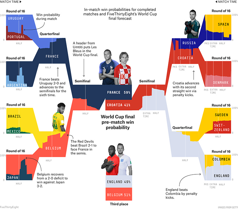
FiveThirtyEight has established a level of trust from its users that few mainstream media outlets can compete with.
Lesson #2: Be as transparent and impartial as possible in your reporting, with a clear explanation of your approach or methodology.
3. Inga Ting, ABC News Australia
Inga Ting has used data-driven techniques across the entire spectrum of news production to strengthen storytelling like the inequity of private vs. public school funding, the near-record downturn in Australian property prices and how widespread cynicism about democracy has pushed more voters to the fringes of politics.
Some of Inga’s techniques include using scrapers to augment existing data API’s, turning crowdsourced information into original datasets, giving readers the ability to participate with decision-based storytelling and integrated visualisation/animation to explain complex analyses.
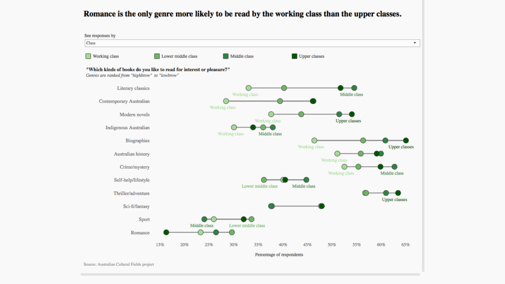
Her story ‘Good taste, bad taste? What your habits reveal about social class’, which investigates how peoples’ standing is affected by their music, TV and book choices, managed to accumulate an incredible 4,635,779 engagement minutes on the ABC website.
Lesson #3: Don’t limit your use of data for storytelling alone. Find ways in which data can support and assist all of your PR activity.
4. Reuters Graphics team
Their name might be somewhat self-explanatory, but the Reuters Graphics team pride themselves on being visual storytellers, whether that’s breaking news or investigative reports. Their core mission is to connect the reader to the material in a way not possible by other means.
With tragedies like the Indonesian plane crash earlier in 2019, Reuters used deeply reported, data-driven ‘explainers’ for powerful and purposeful insights as they unfolded. However, they apply much of the same methodology to investigatory projects too, including the ‘Ocean shock” series that took a year of sifting through data, collecting stories and visualising the results.

But despite the fact Reuters has access to an incredible number of resources, including people and technology across the world, it always pays “careful consideration to the tone and subject matter as expressed through the design of the story.”
Lesson #4: The best stories always put people at the centre of the narrative. From natural or unexpected disasters to the effects of climate change, audiences gravitate towards commonality.
5. Ashley Kirk, The Telegraph
Over the past year, Ashley Kirk has played a part in over 100 data-led stories for the Telegraph, helping to transform how it communicates to an engaged audience of subscribers as well as the wider community. She has also helped deliver a new subscription strategy using data journalism methods to help guarantee sustainable funding.
“With The Telegraph’s new subscriptions strategy, data journalism proved essential in providing highly personalised, quality online journalism that would persuade people to join our community,” said Ashley.
“Through interactive tools which personalise stories based on a reader’s demographic or geographic details, I have been able to contribute to plans to retain and strengthen our core audience of subscribers by using data visualisation that engage them on an individual, personal basis.”

Some of Ashley’s biggest breakthroughs include freedom of information requests that revealed how every British police force have experienced increased response times in the last three years and an interactive game for the World Cup which allowed allowed readers to pick what they believed were the most important factors in deciding a football match.
Lesson #5: The sky’s the limit. Regardless of the story you’re telling, the sheer scale of readily available data means that multiple narrative threads can be pulled for the most captivating and convincing copy.