

For the Online PR Show at Brighton SEO 2021, I presented my framework, which allows digital PR teams to turn datasets (of any size) into newsworthy and campaignable stories.
Following the framework, digital PR teams will spot the stories hidden within a spreadsheet packed full of data without needing a degree in data analysis.
The framework was designed for teams who:
- Already run data-led digital PR campaigns but want to squeeze more out of them
- Would like to produce data-led campaigns but don’t know where to start
- Want to target journalists and audiences in different sectors
This talk will reveal how we explore every avenue when putting our digital PR campaigns together without a computer science degree.
Turning spreadsheets into stories: a framework for interpreting large datasets into campaign-able stories
Data-led digital PR campaigns are my comfort zone. I default to this campaign style when I know I need the campaign to land lots of very high quality or niche links. By no means are they the only type of campaigns we run here at JBH, but I know we can build more links with campaigns backed by data than we can without it.
But, I am not a data scientist or a maths expert, in fact, I barely passed my maths GCSE, so I needed to create a framework that would help me (and now you) uncover the magic that lies between the spreadsheets.
By following my three-step framework you’ll be able to:
- Extract newsworthy stories from any data set
- Get more stories out of every campaign that you run (and pitch more journalists)
- Present your data-led campaigns in a much more compelling way
So why did I develop this framework?
I see so many campaigns being shared with impressive data behind them (shoutout to the PR data analysts in the room). Still, when I check the coverage, maybe one or two generic angles landed coverage. But what we don’t hear as much is what we do with that data once we have it.
Why are we exhausting ourselves and not our datasets?
Earlier this year, the JBH team had a creativity masterclass with Mark Johnstone, and he said something that stuck with me, and I asked him if I could share this with everyone.
Data is only as good as the questions we ask it
And that resonated with me.
The data already holds all of the stories. We just need to use our storytelling skills to figure them out. In the same way that a journalist will use specific lines of questioning to get the scoop.
We must interrogate our datasets to get our own scoop. And you can start with these three questions:
- What stories do you care about the most?
If you were only able to get one story out of this dataset, what should it be? What do you care the most about?
- What are the secondary stories?
What are the second, third and fourth stories you hope to get from this dataset? Write them down and go looking for them.
- What is the juiciest story?
What is the key nugget of information that is going to get those journalists clicking on your email
Here’s how you can turn spreadsheets into stories with JBHs digital PR framework
Onto the framework and starting with the techniques I repeatedly use to make sure I am getting as many stories as possible out of every campaign we launch.
Rescue a dead dataset with the multiplier technique
You’ll see journalists use this technique all of the time, and it’s something we can use too! Multipliers help audiences make sense of statistics.
Per Capita is probably the most common multiplier and it’s really just a fancy way of saying per person.
So let’s say you are working on a campaign looking to discover which city in Europe has the greenest space for residents to enjoy. Even without looking at the data, we can probably guess that London would be ranked the top city.
But that’s not very interesting. Would you talk about that with your mates down the pub? It doesn’t pass the ‘so what test’…yet.
You can get a brand new story by using the multiplier technique:
Divide the total amount of green space by the number of people who would have to share that space (population), putting Paris at the top of the table.


There are many other ways you can use multipliers, and all can help rescue a dead or disappointing dataset.
This year, we launched a campaign that looked at the best countries worldwide for startups based on the availability of government grants and support. I hoped that somewhere really quirky and unexpected would come out on top.
But it was the USA. I didn’t pass the ‘so what’ test. I needed to make this campaign more compelling.
So I went back into the raw dataset and asked it some more questions.
We divided the number of start-up businesses by the number of established businesses to find out which country had the highest ratio of start-ups.
Canada topped the ranking, along with a whole new pool of journalists to pitch.
Make data more digestible with the comparisons and groupings technique
Comparisons and groupings are another technique we use to make big stats feel and sound more digestible.
Can you visualise what 429,000 tonnes of greenhouse gas looks like? I don’t think I could.
So let’s compare that figure to something we can all relate to.

We ran a campaign last November that predicted the amount of carbon emissions released into the atmosphere due to our love for online shopping.
Great data, timely, shocking, newsworthy – all the things we love in a digital PR campaign – but we needed to get the messaging right.
We did that using the comparison technique – we worked out what 429,000 tonnes of carbon would be in return flights between London and New York and the same weight in Elephants.

Use spin to make your data sound more impressive
Spin is the third and final part of the framework and quite possibly the most fun. Spin doesn’t have to be negative. You are using your skills to communicate the story most effectively.
Let’s take this market research data for tails.com, revealing the UK’s most pampered pooches. If we take the data at face value, these are the stories we have:
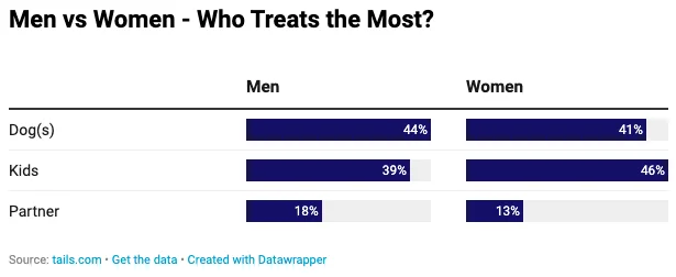
- Dogs owned by women get 41% of the treats in a household
- Dogs owned by men get 44% of the treats in the household
- Men more generous with treats than women
On the surface, this data doesn’t contain much of a story – the percentages between men and women are too close together to be a story on their own.
Let’s take another look and see how else we can slice and dice this data.
The angle I was looking for was ‘it’s me or the dog’ – tapping into the well-known rivalry between couples and their pets.
So, how often do women treat their dogs vs treating their partners?
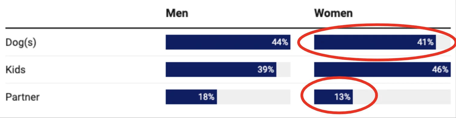
Here, we can see that women are three times more likely to buy treats for their dogs than their partners.
This is more compelling, and I can already see the headlines this story will generate:
Using my framework, you’ll now be able to squeeze more out of every single campaign you launch
- You’ll pitch more stories and broaden that pool of prospects
- You’ll save yourself time and headaches
- You’ll exhaust your datasets and not yourself